AMAZON GROCERY
Delivering a fresh, flexible rebrand in record time.
Amazon’s growing grocery portfolio needed one simplified system that shoppers could trust.
ALDI
-
Amazon Fresh private label wasn’t broken. But it was busy. Overlapping brands had piled up across every aisle, making it harder for shoppers to quickly understand what they were buying. The goal wasn’t to reinvent, but simplify: Create a clear, three-tier system that could stretch across hundreds of categories and still feel unmistakably Amazon.
We were chosen after a competitive RFP for our ability to turn strategy into scalable packaging systems. But this was no small feat. Each category came with its own rules. Multiple teams across Amazon and Whole Foods needed to be on the same page. And the system had to work fast at shelf for shoppers in a pinch.
-
When you’re designing for grocery, clarity isn’t a nice-to-have. It’s everything. So, before we put pencil to paper, we got in the room, aligning Amazon, Whole Foods and our team around a shared goal, process and definition of success. We worked side by side with the Whole Foods design team, building a creative approach before bringing it to Amazon.
From the start, the shopper led the way. We studied how categories show up on shelf, what existed and what was coming next. From snacks to produce to frozen meals, the system needed to flex without losing its base. We looked closely at competitors and shopper behavior to understand what people register in the first few seconds and what helps them choose with confidence.
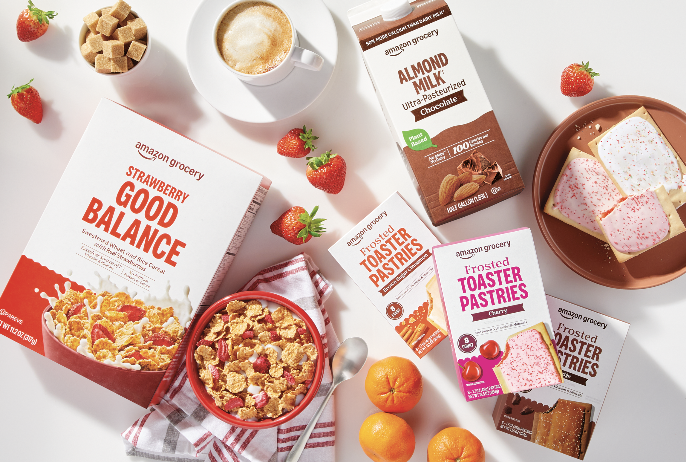
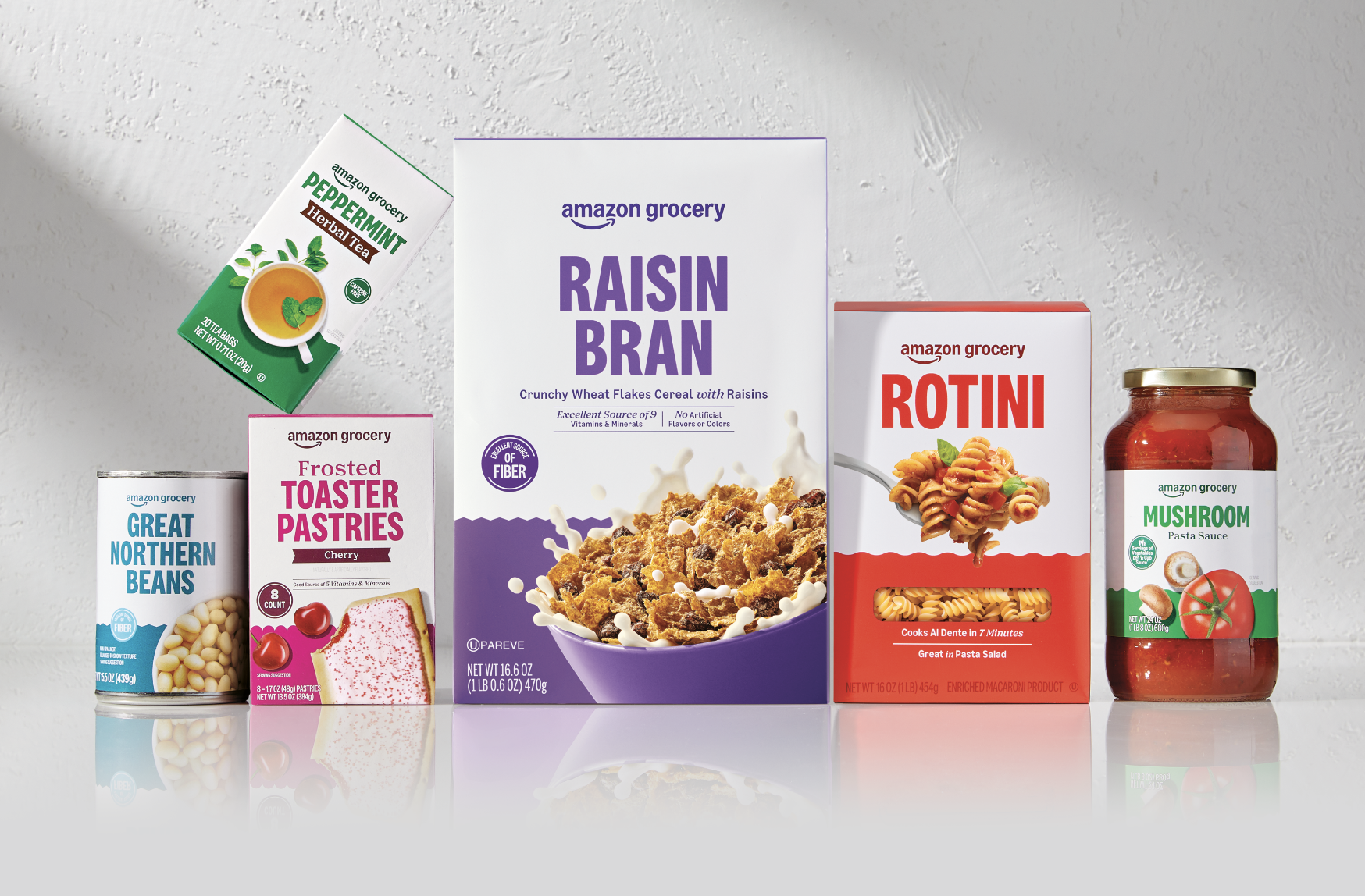
That insight shaped the system. The Amazon logo and clean white space create instant recognition. Color, pattern and photography shift by category to signal flavor, freshness or function. To keep everything consistent, we art directed the food photography in a dedicated Austin studio.
The result is a system that feels cohesive across the store, but never generic — built to move quickly, make sense and earn shopper trust. -
The biggest challenge was speed. Timelines were aggressive, and the volume was massive. At peak, dozens of new products were kicking off every week, with hundreds moving through the system.
So, we built a workflow that never slept. We partnered with overseas teams to keep work moving around the clock. Pre-built templates gave designers a headstart. Overnight revisions kept momentum when timelines got tight. We launched an Austin photo studio to meet demand, while Quad’s rendering team produced thousands of e-commerce images once designs were approved.
At the same time, we were also balancing two perspectives. Amazon and Whole Foods shared the same goal, but came from different viewpoints shaped by their existing systems. Our role was to bridge those points of view, keep momentum and protect the integrity of the brand as it took shape. Through tight coordination, global collaboration and disciplined execution, we delivered one of the most ambitious packaging overhauls in Amazon history. -
This became the fastest rebrand in Amazon’s history, transforming a sprawling private label portfolio into a system that works harder for shoppers. Clearer to navigate. Easier to trust. Built to keep pace with how people actually shop.
Across hundreds of categories and thousands of touchpoints, the system brings consistency without sameness. The Amazon Grocery logo does the heavy lifting, while clearer claims, instructions and visuals reduce decision fatigue and help shoppers choose with confidence.
The impact wasn’t just operational. It was felt. As one Amazon executive shared:
“Working with Favorite Child feels like working with an extension of our own team. Their creativity, partnership and collaborative energy truly make every project better. We couldn’t ask for a stronger partner in the packaging design space.”Fast. Focused. Built to scale. And designed to make Amazon Grocery easier to shop, everywhere it shows up.