ALDI FLAGSHIP BRAND
Delivering delight to every shelf in the store.
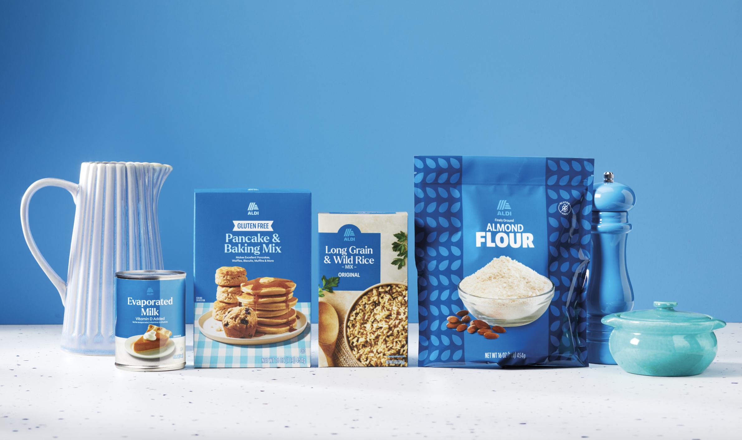
With ALDI’s rapid growth and cult-level fandom, the brand needed a packaging design that looks as good as shopping ALDI feels.
ALDI
-
ALDI’s packaging hadn’t kept up with its evolving brand image and growth. The design wasn't consistent across the store and didn’t communicate the high standards behind every product. Plus, small store footprints made standing out against other SKUs in limited shelf space even more challenging.
So after years of strategizing, ALDI consolidated 90+ brands down to 30, and prepped for its first-ever private-label branding that featured the ALDI name. Using our strategic Favor Factors process, we dug into how shopper trust, pride and emotional connections to ALDI’s private label could help turn a “smart value” into “value with swagger.” -
First we looked inward with stakeholder interviews and store walk-throughs. Then we tapped category experts and brand advocates, and we found that ALDI’s packaging didn't live up to its fans’ passion. That brought us to "Delight in the Everyday," a positioning that combines the work ALDI puts into every product with the savvy satisfaction of ALDI shoppers. It set the table for a design system that could span 90+ categories while maintaining one distinct ALDI look.
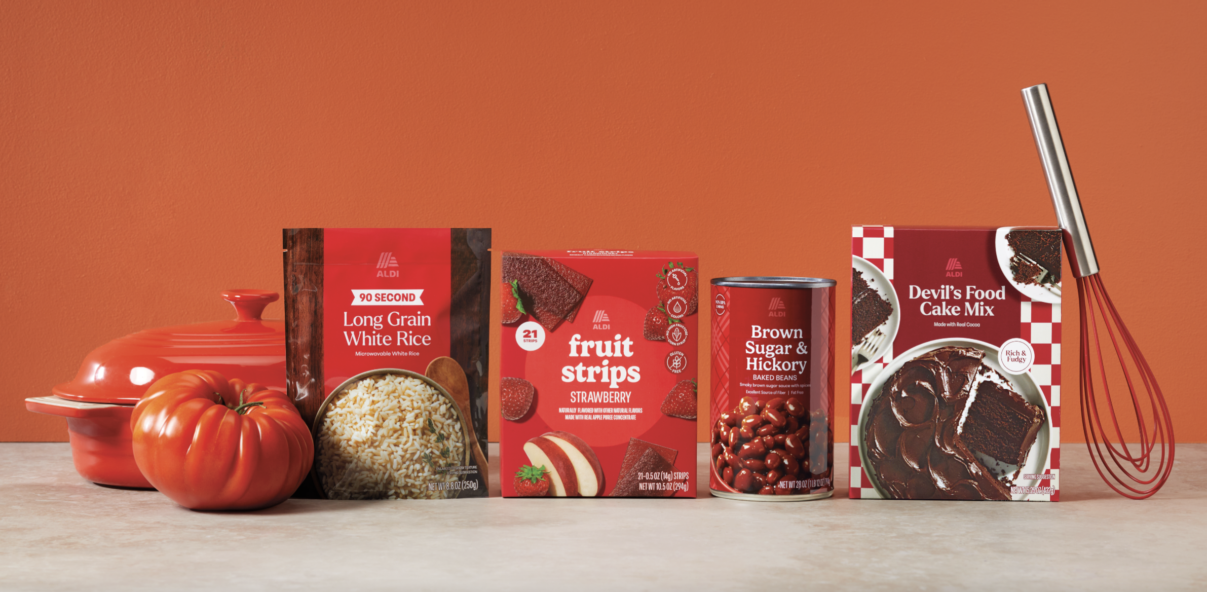
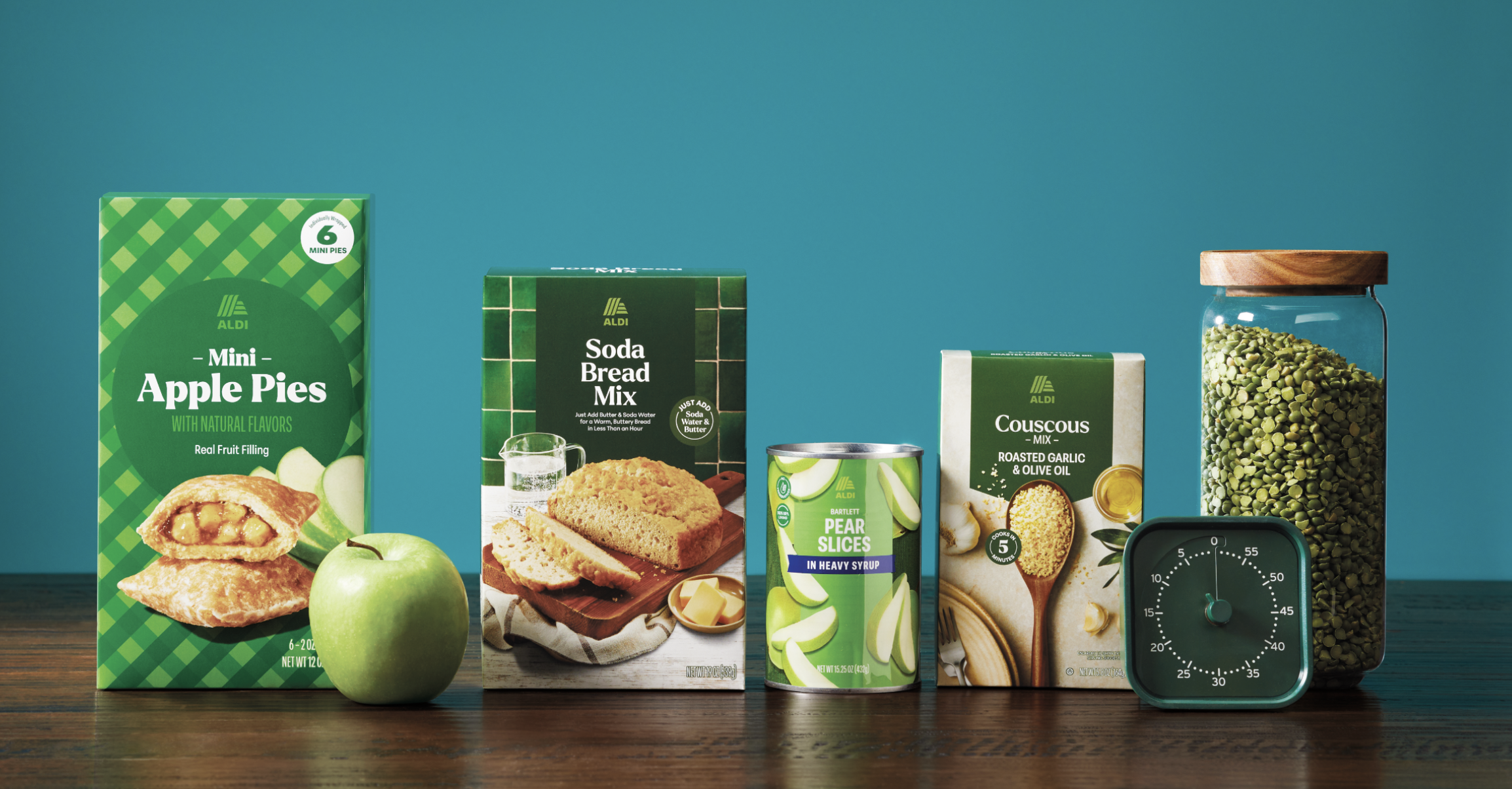
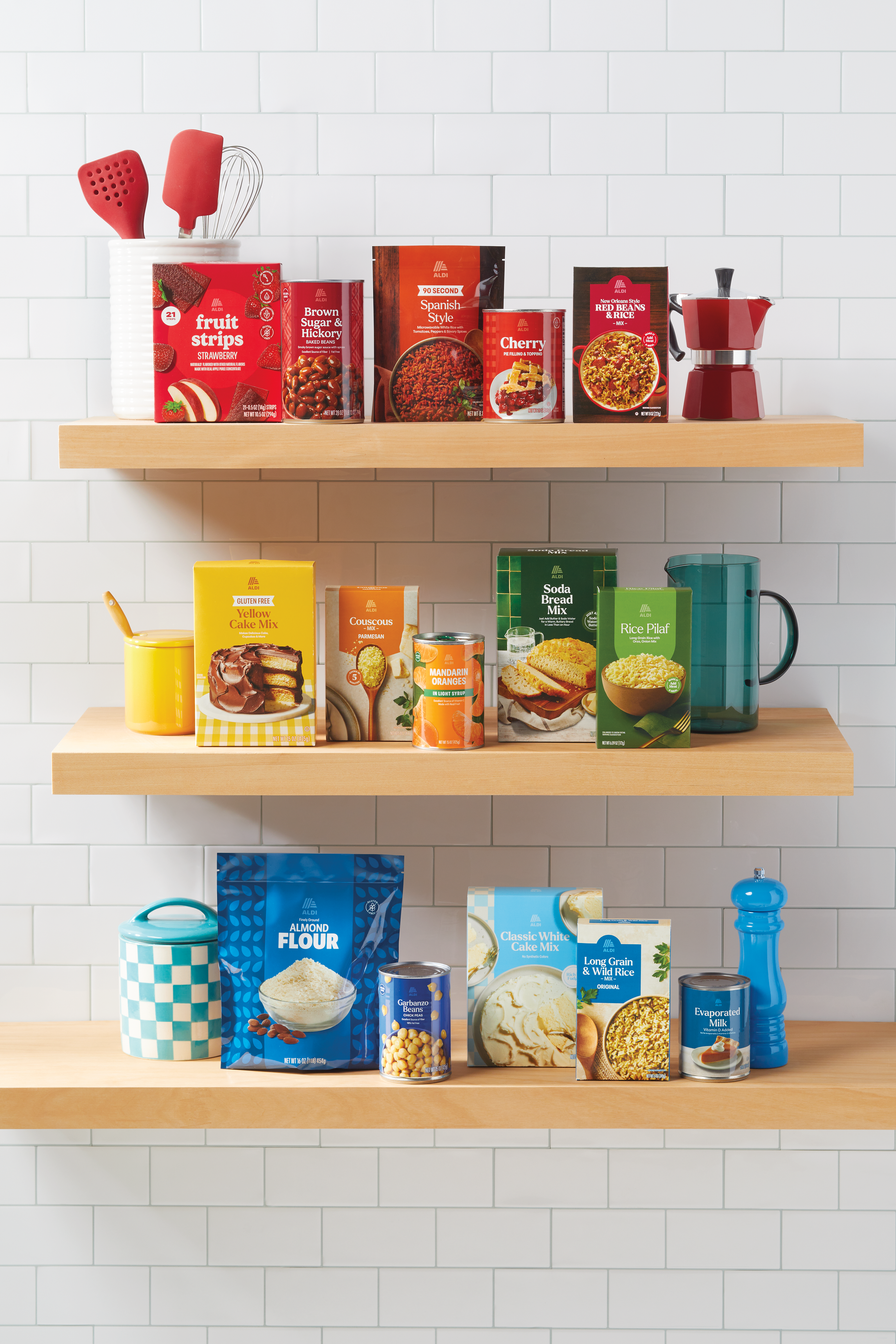
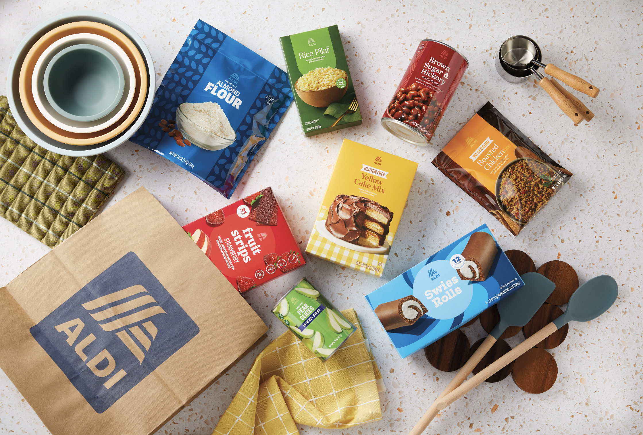
Visually, it needed to be human. Warm. Modern. Adaptable. We built a system around a simplified wordmark with a modular "A." To maintain variety on shelf, we chose harmony over rigid rules. Shared elements anchored the brand, while expressive color, imagery, illustrations and patterns added individual personality. The flexible system offers cohesion and character.
-
The rollout was a study in complexity with multiple suppliers for single SKUs, dozens of dielines, and countless regulations. But across suppliers, leadership and the globe, Favorite Child made sure the strategy was in lockstep. And Quad’s production power helped simplify our lift, from premedia to versioning to global workflow. Photography was another huge lift, and Betty Studios helped crush it. Shooting hundreds of images (3 shoot days/week!) with real-time rendering and retouching support helped us achieve real product imagery, really fast.
Toolkits, decision trees and robust QC guaranteed a system that consistently looked as good as it worked across categories, all while providing scalability and adaptability for future iterations. -
ALDI’s new packaging has helped reshape how shoppers view the brand. Deeper than just functional shelf nav, it’s helped make stronger emotional connections, serving up added personality, quality and pride.
The launch generated major national media attention, too, with features by CNN Business, Fast Company, Reuters, Modern Retail and more — totaling over 953.7 million potential impressions.But we think maybe ALDI leadership said it best…
“Favorite Child was able to do what no other agency could do. They understood our customer, our leadership, our strategy, and translated all of it into every product on our shelves. The new way shoppers will see us has been profoundly driven by Favorite Child.”
— Kristy Reitz, Director Brand & Design, ALDI